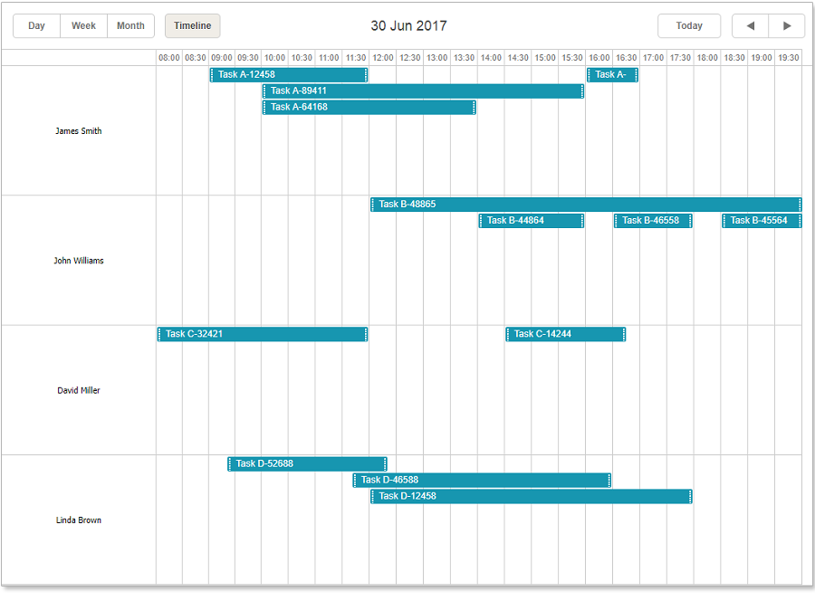
dhtmlxScheduler is one of the most flexible components available, but yet when you check the basic examples of dhtmlxScheduler, they can look pretty far from a final result and feel that you need to implement. And a usual challenge for developers that are new to dhtmlxScheduler is how do I get from this:
![timeline scheduler]()
to this:
![hotel calendar]()
At this point familiarizing with the API and figuring the appropriate approach can take an unnecessarily long time.
In this tutorial, we want to show you some frequently used settings in order to speed up this process. We’ll start from a plain timeline config and will show how to make it into something more complex, like our hotel reservation demo.
When you understand how our Scheduler component works, it’ll be much simpler for you to develop any functionality you want. As a result of this tutorial, you will learn how to work with the Scheduler’s timeline and be able to configure it based on your needs.
Now, let’s define which features we will implement during the tutorial:
![features]()
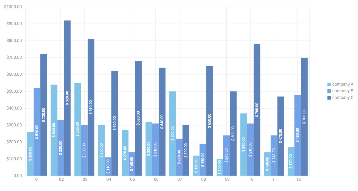
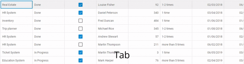
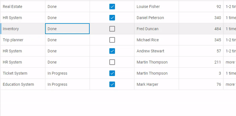
- Filtering allows visualizing the rooms according to particular criteria
- Timescale should be changed to show a full month
- Lefthand labels, step one. We’ll add a header above the lefthand column
- Lefthand labels, step two. We’ll add the possibility to display multiple columns with a custom HTML content and colors
- The default appearance of the event boxes will be changed
- We’ll add custom tooltips
- We’ll add the highlight for the days off
As we successfully defined what should be done, we can proceed with the code writing.
Step 0 – Prerequisites
We’re starting with the plain timeline view, like the one you can find in our package:
Before proceeding with the coding, we’re doing some preparations.
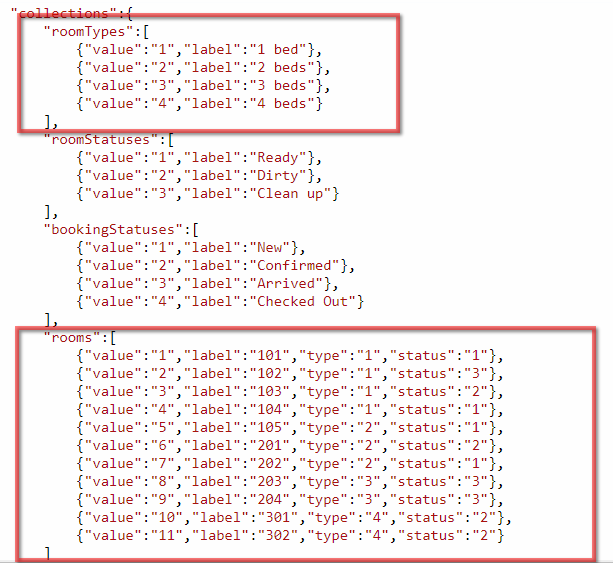
Firstly we add test data – we need lists of bookings, rooms, room types, booking statuses (confirmed, arrived, etc.) and room statuses (ready, clean up, dirty). In this tutorial we’ll load all of this in a single json document formatted like this.
All arrays from the “collections” part of json can be accessed using scheduler.serverList method by their respective name.
If the list objects have the expected structure (`key` and `value` properties), they can be connected to the timeline/units views or to the lightbox select controls directly. Moreover, if you reload data or update these collections from code, the views and controls connected to the appropriate collections will be repainted automatically in order to reflect the changes.
Thus, the data models may look as following:
booking:
{
"id":"1",
"start_date":"2017-03-02",
"end_date":"2017-03-23",
"text":"A-12",
"room":"1",
"status":"1",
"is_paid":"1"
}
room:
{
"value":"1",
"label":"101",
"type":"1",
"status":"1"
}
booking status:
{
"value":"3",
"label":"Arrived"
}
room status:
{
"value":"1",
"label":"Ready"
}
room type:
{
"value":"2",
"label":"2 beds"
}
And here is how a complete JSON will look like. After we connect list of rooms to the timeline view, we’ll be able to see the following calendar and drag bookings between rooms:
Another small thing we can do is to set the default values, such as booking status, paid status or a default text. It is usually done via onEventCreated event:
scheduler.attachEvent('onEventCreated', function (event_id) {
var ev = scheduler.getEvent(event_id);
ev.status = 1;
ev.is_paid = false;
ev.text = 'new booking';
});
Check the code.
And now let’s go through the list of features we made.
Step 1 – Filtering timeline rows (rooms)
As we’ve found out at the previous step, we have a list of rooms which are displayed as rows of the timeline, and room types which are associated with the rooms:
![values]()
What we want here is to filter timeline rows by the room type, e.g. ‘show two bed rooms only’.
How it’s usually done – scheduler allows dynamically replacing timeline rows with a new collection using
scheduler.serverList/updateCollection.
Knowing this, the task is pretty simple.
1) We connect the timeline to the empty serverList:
scheduler.createTimelineView({
...
y_unit: scheduler.serverList("visibleRooms"),
...
});
2) Then we define a function that filters a complete list of rooms, select ones that pass the filter and put them into “visibleRooms” list, updating the timeline:
window.showRooms = function showRooms(type) {
var allRooms = scheduler.serverList("rooms");
var visibleRooms ;
if (type == 'all') {
visibleRooms = allRooms.slice();
}else{
visibleRooms = allRooms
.filter(function(room){
return room.type == type;
});
}
scheduler.updateCollection("visibleRooms", visibleRooms);
};
3) Once data is parsed, we can run the filters in order to populate the timeline initially:
scheduler.attachEvent("onParse", function(){
showRooms("all");
});
When you will replace data loading from a client-side resource by scheduler.parse() method with data loading from a server-side resource by scheduler.load(), you must also replace onParse with onLoadEnd.
Here is how everything looks at this point.
Finally, let’s add a dropdown for a user to change the filter.
We can put it on the place of .dhx_cal_tab elements in the scheduler header:
<div id="scheduler_here" class="dhx_cal_container" style="width:100%; height:100%;">
<div class="dhx_cal_navline">
<div class="dhx_cal_prev_button"> </div>
<div class="dhx_cal_next_button"> </div>
<div class="dhx_cal_today_button"></div>
<div class="dhx_cal_date"></div>
<select id="room_filter" onchange='showRooms(this.value)'></select>
</div>
<div class="dhx_cal_header">
</div>
<div class="dhx_cal_data">
</div>
</div>
scheduler.attachEvent("onParse", function(){
showRooms("all");
var roomSelect = document.querySelector("#room_filter");
var types = scheduler.serverList("roomTypes");
var typeElements = ["<option value='all'>All</option>"];
types.forEach(function(type){
typeElements.push("<option value='"+type.key+"'>" + type.label +"</option>");
});
roomSelect.innerHTML = typeElements.join("")
});
And that’s how we implement the filtering:
Step 2 – Displaying a full month in the time scale
As per requirements, we need a two line time scale – one day per cell of the time scale, and the month line on top of days. Also, the timeline should show a complete month.
The time unit and number of columns of the timeline view are defined by x_size/x_step/x_date properties of configuration object. It also allows adding a second row to the time scale.
So, intuitively we can get a config like this:
scheduler.createTimelineView({
name: "timeline",
x_unit: "day",
x_date: "%j",
x_step: 1,
x_size: 31,
section_autoheight: false,
y_unit: scheduler.serverList("visibleRooms"),
y_property: "room",
render:"bar",
round_position:true,
dy:60,
second_scale:{
x_unit: "month",
x_date: "%F, %Y"
}
});
And get a timeline looking like this:
You may see a problem here – the timeline must always start from the first day of the month, and a number of columns should match a number of days per month, which may vary.
How do we solve this? We can access the instance of the timeline view from code and modify the number of days per view according to the displayed month. We can do it each time the displayed date is changed using onBeforeViewChange event.
scheduler.attachEvent("onBeforeViewChange", function(old_mode,old_date,mode,date){
var year = date.getFullYear();
var month= (date.getMonth() + 1);
var d = new Date(year, month, 0);
var daysInMonth = d.getDate();
var timeline = scheduler.getView('timeline');
timeline.x_size = daysInMonth;
return true;
});
Then we need to make sure that timeline starts from the first day of the month, this can be done using scheduler.date[timelineName + “_start”] method. This method is defined by the timeline instance and controls the starting point of the time scale:
scheduler.date.timeline_start = scheduler.date.month_start;
We use a ‘month_start’ method of scheduler date helper, which does exactly what we need.
Finally, we need to make sure that the timeline is scrolled for exactly one month when user clicks forward/backward navigation in the scheduler head. We do it by redefining scheduler.date.add_timeline method. This is also a generic scheduler.date[“add_” + viewName] method that is defined for the each view:
scheduler.date.add_timeline = function(date, step){
if(step > 0){
step = 1;
}else if(step < 0){
step = -1;
}
return scheduler.date.add(date, step, "month")
};
Note that the scheduler.date methods of the timeline should be declared after scheduler.createTimelineView call, otherwise the timeline will overwrite them.
And now you should have a correct month scale:
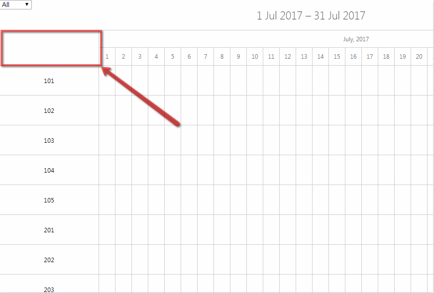
Step 3 – Adding a header to the lefthand column of the timeline
Now we need to add a header here:
![header scheduler]()
There is timeline_scale_label template to set required markup into the header of Y-Axis in the Timeline view.
So, we’ll put HTML elements that we need to create 3 header’s columns into the variable and then will set this variable as the value of the template.
The code may look as following:
var headerHTML = "<div class='timeline_item_separator'></div>" +
"<div class='timeline_item_cell'>Number</div>" +
"<div class='timeline_item_separator'></div>" +
"<div class='timeline_item_cell'>Type</div>" +
"<div class='timeline_item_separator'></div>" +
"<div class='timeline_item_cell room_status'>Status</div>";
scheduler.locale.labels.timeline_scale_header = headerHTML;
And css:
.timeline_item_cell {
width: 32%;
font-size: 14px;
text-align: center;
}
.timeline_item_separator {
background-color: #CECECE;
width: 1px;
height: 100% !important;
}
.timeline_item_separator,
.timeline_item_cell {
vertical-align:top;
height: 100%;
display:inline-block;
line-height: 60px;
vertical-align:top;
}
Step 4 – Adding multiple columns to the left part of the timeline
Scheduler always creates a single column before the time scale of the timeline, and as of the current version, there is no way to tell it otherwise.
The good news are, we have a complete control over the contents of that column via template function. Thus, we can put any html into that column, including extra cells.
In short, the code may look like following:
scheduler.attachEvent("onTemplatesReady", function(){
function findInArray(array, key) {
for (var i = 0; i < array.length; i++) {
if (key == array[i].key)
return array[i];
}
return null;
}
function getRoomType(key) {
return findInArray(scheduler.serverList("roomTypes"), key).label;
}
function getRoomStatus(key) {
return findInArray(scheduler.serverList("roomStatuses"), key);
}
function getRoom(key) {
return findInArray(scheduler.serverList("rooms"), key);
}
scheduler.templates.timeline_scale_label = function (key, label, section) {
var roomStatus = getRoomStatus(section.status);
return ["<div class='timeline_item_separator'></div>",
"<div class='timeline_item_cell'>" + label + "</div>",
"<div class='timeline_item_separator'></div>",
"<div class='timeline_item_cell'>" + getRoomType(section.type) + "</div>",
"<div class='timeline_item_separator'></div>",
"<div class='timeline_item_cell room_status'>",
"<span class='room_status_indicator room_status_indicator_"+section.status+"'></span>",
"<span class='status-label'>" + roomStatus.label + "</span>",
"</div>"].join("");
};
});
And css:
.collection_label {
z-index: 2;
}
.room_status {
position: relative;
}
.room_status_indicator {
position: absolute;
background-color: red;
left: 0;
top: 0;
right: 95%;
bottom: 0;
}
.room_status_indicator_1 {
background-color: #4CAF50;
}
.room_status_indicator_2 {
background-color: red;
}
.room_status_indicator_3 {
background-color: #FFA000;
}
Step 5 – Changing the color and the inner contents of the event boxes
There are three settings that define the look of an event in the timeline view:
1) the height of the event box is defined by event_dy property of the Timeline config.
2) css class applied to the event box
3) and the inner html of the event box
We’ll need all of them.
Firstly, let’s make events occupy the whole height of the timeline row:
scheduler.createTimelineView({
...
event_dy: "full",
...
});
Now let’s color events based on their status.
For that we’ll need css rules for each status, for this tutorial we’ll simply hardcode them:
.event_1 {
background-color: #FFB74D !important;
}
.event_2 {
background-color: #9CCC65 !important;
}
.event_3 {
background-color: #40C4FF !important;
}
.event_4 {
background-color: #BDBDBD !important;
}
And assign these classes to the appropriate events:
scheduler.templates.event_class = function (start, end, event) {
return "event_" + (event.status || "");
};
And the coloring should be done:
The template is called each time the event is repainted. So, if a user changes event status from the UI, a new color will be immediately applied.
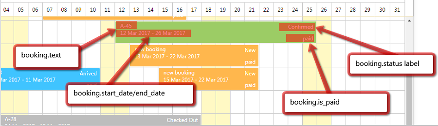
And now we move to the inner content of events. As you remember, our aim is something like this:
![labels]()
Here is how it can be implemented:
function getBookingStatus(key) {
var bookingStatus = findInArray(scheduler.serverList("bookingStatuses"), key);
return !bookingStatus ? '' : bookingStatus.label;
}
function getPaidStatus(isPaid) {
return isPaid ? "paid" : "not paid";
}
var eventDateFormat = scheduler.date.date_to_str("%d %M %Y");
scheduler.templates.event_bar_text = function (start, end, event) {
var paidStatus = getPaidStatus(event.is_paid);
var startDate = eventDateFormat(event.start_date);
var endDate = eventDateFormat(event.end_date);
return [event.text + "<br />",
startDate + " - " + endDate,
"<div class='booking_status booking-option'>" + getBookingStatus(event.status) + "</div>",
"<div class='booking_paid booking-option'>" + paidStatus + "</div>"].join("");
};
And css:
.booking_status, .booking_paid {
position: absolute;
right: 5px;
}
.booking_status {
top: 2px;
}
.booking_paid {
bottom: 2px;
}
.dhx_cal_event_line:hover .booking-option {
background: none !important;
}
Step 6 – Tooltips
Tooltips are defined in the extension file which has to be added to the page after dhtmlxscheduler.js.
<script src="./scheduler/ext/dhtmlxscheduler_tooltip.js"></script>
After that we can define a tooltip content using tooltip_text template.
scheduler.templates.tooltip_text = function (start, end, event) {
var room = getRoom(event.room) || {label: ""};
var html = [];
html.push("Booking: <b>" + event.text + "</b>");
html.push("Room: <b>" + room.label + "</b>");
html.push("Check-in: <b>" + eventDateFormat(start) + "</b>");
html.push("Check-out: <b>" + eventDateFormat(end) + "</b>");
html.push(getBookingStatus(event.status) + ", " + getPaidStatus(event.is_paid));
return html.join("<br>")
};
Note that we reused helper functions we’ve declared for event text and header templates, all these templates are supposed to be declared in the same scope.
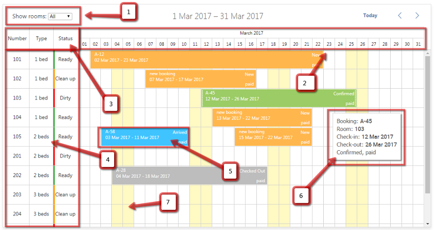
And here is how the result looks like:
There are a couple of things to consider regarding tooltips.
Tooltip template can be called very frequently. It’s preferable not to make the tooltip_text function too heavy. If the tooltip should show a result of some relatively complex calculations, it’s better to precalculate values and save them into some property of the event object, rather than calculating them each time from the tooltip template.
Find out the related docs here and here.
The template function does not support async/promise result and you can’t use synchronous requests there (technically one could, but that would hit client-side performance and usability hard).
Thus, if you need to load tooltip content from the backend, simply requesting the data from a tooltip wouldn’t be enough.
This is usually solved by loading the tooltip content into some property of an event via ajax and returning this property value from the tooltip template. If the property value is not loaded from the server yet, you can display some kind of placeholder. Here is a jsfiddle where we emulate ajax loading with timeouts, but the idea is the same.
Step 7 – Highlight weekends
It’s also done with the help of the extension which allows coloring time ranges from code.
One important thing – if you use the dhtmlxsheduler_limit.js extension together with the timeline, it should be added before the dhtmlxscheduler_timeline.js:
<script src="./scheduler/dhtmlxscheduler.js"></script>
<script src="./scheduler/ext/dhtmlxscheduler_limit.js"></script>
<script src="./scheduler/ext/dhtmlxscheduler_timeline.js"></script>
After you add the extension you can color days like this:
scheduler.addMarkedTimespan({
days: [0, 6],
zones: "fullday",
css: "timeline_weekend"
});
CSS:
.timeline_weekend {
background-color: #FFF9C4;
}
Here is the result:
A more complex use-case would involve loading areas you want to highlight from the backend.
Usually it’s done from onBeforeViewChange event. You can detect when the displayed date is changed and start loading markers for the displayed range.
Once they loaded – you can add them using scheduler.addMarkedTimespan and repaint scheduler to display them:
Step 8 – Configuring the lightbox
What we need from the details form:
For this we’ll need to add extensions where these controls are defined:
<script src="./scheduler/dhtmlxscheduler.js"></script>
<script src="./scheduler/ext/dhtmlxscheduler_minical.js"></script>
<script src="./scheduler/ext/dhtmlxscheduler_editors.js"></script>
And update the settings of the lightbox:
scheduler.config.lightbox.sections=[
{map_to: "text", name: "text", type: "textarea", height: 24},
{map_to: "room", name: "room", type: "select", options: scheduler.serverList("visibleRooms")},
{map_to: "status", name: "status", type: "radio", options: scheduler.serverList("bookingStatuses")},
{map_to: "is_paid", name: "is_paid", type: "checkbox", checked_value: true, unchecked_value: false},
{map_to: "time", name: "time", type: "calendar_time"}
];
Note that no lightbox controls have a config for the default value – that’s intentional. Lightbox controls are configured to read the value from specific properties of the event object.
That means that instead of setting a default value for the lightbox control, you should set default property values of the scheduler event object itself. It’s done like we did in the step 0, the lightbox will reflect them once opened.
Also, add a following config for labels of lightbox controls:
scheduler.locale.labels.section_text = 'Name';
scheduler.locale.labels.section_room = 'Room';
scheduler.locale.labels.section_status = 'Status';
scheduler.locale.labels.section_is_paid = 'Paid';
scheduler.locale.labels.section_time = 'Time';
After that you’ll get the lightbox looking like this:
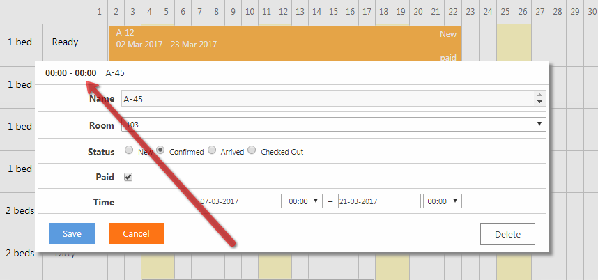
As you can notice, the description at the top-left container of the lightbox is now not quite useful for us:
![time lightbox]()
We can redefine this content. Check the docs.
scheduler.templates.lightbox_header = function (start, end, ev) {
var formatFunc = scheduler.date.date_to_str('%d.%m.%Y');
return formatFunc(start) + " - " + formatFunc(end);
};
Step 9 – Preventing double bookings for the same time
To avoid double bookings, we’ll use this extension.
<script src="./scheduler/ext/dhtmlxscheduler_collision.js"></script>
Once you add it to the page, it will revert actions that put several events to the same time.
You can also control this behavior by capturing the onEventCollision event either to conditinally allow double bookings, or simply show a user some warning
scheduler.attachEvent("onEventCollision", function (ev, evs) {
for (var i = 0; i < evs.length; i++) {
if (ev.room != evs[i].room) continue;
dhtmlx.message({
type: "error",
text: "This room is already booked for this date."
});
}
return true;
});
Conclusions
Overcoming the learning curve of dhtmlxScheduler, you’ll see that it’s possible to build on new features and change the look and behavior of the component pretty simply. We hope that this tutorial gave you a clear understanding how the Timeline of dhtmlxScheduler behaves and helped you in achieving your own goals when building your applications.
If you’re already familiar with our tutorials, you may notice that this time we used jsfiddle to provide you with a more detailed and informative description of each step. Do you find it useful?
Also, if you have any thoughts and ideas what the next topics/tutorials you would like to discover, don’t hesitate to share them in comments. We are open for suggestions.
Originally published on Dec 21, 2017, 14:00
The post How to Make Hotel Booking Calendar with dhtmlxScheduler appeared first on DHTMLX Blog.
 Check the sample >
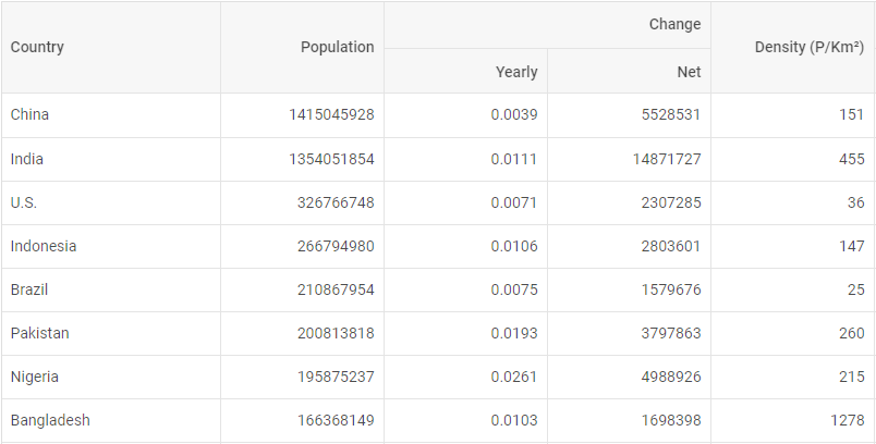 Check the sample >
 Check the sample >
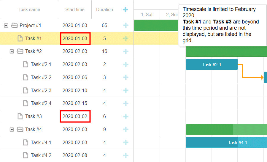
 There are two possible solutions for that. We can either add a horizontal scrollbar into the grid and make it thinner, or allow a user to select which columns are going to be visible.
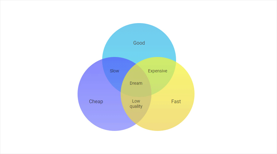 Venn diagrams are designed for finding patterns and defining logical relations among groups of objects, which are usually split into 3 sets. Overlapping areas stand for common characteristics of objects in question.
  Network diagrams usually depict the structure of telecommunication systems. Besides, they can be applied in project management for showing the process flow.
 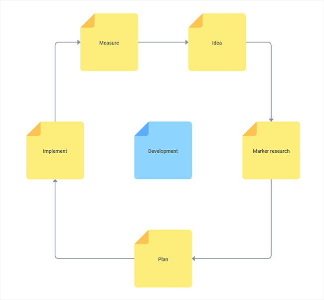 Life cycle diagrams make it easy to illustrate the stages of a product’s or project’s life cycle. In our example, the stages of the development process are designed with the help of yellow sticky notes.
 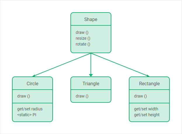 UML Class Diagram for software engineering. Check the samples with
 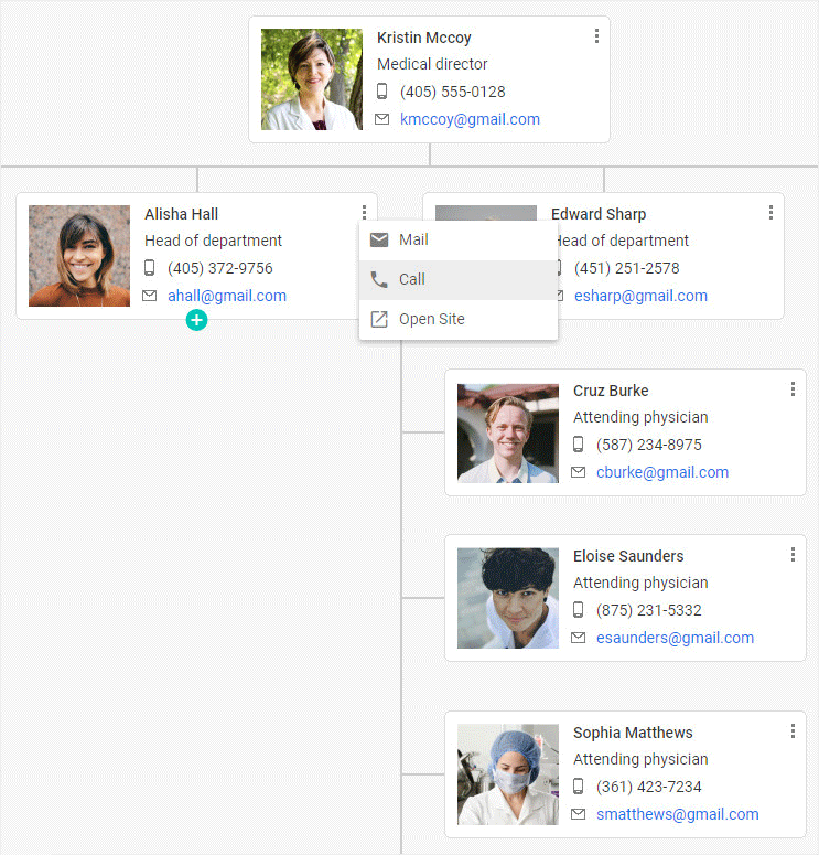 Hospital org chart illustrating medical hierachy.
 Uploader inside the Ribbon component.
 Menu items with custom icons.